Thesis

Emotional Echoes
A Psychological Analysis of Perception & Emotions in Visual Communication
Author: Theresa Smillie
Date Published: May, 2001
Abstract
Within Visual Communication, clarity of a message or an idea can be achieved by combining the elements of design with the emotions of the viewer. General perceptions of society can be gauged by using emotional empathy to determine the use of these graphic elements.
Design
Design is composed of many different elements; line, space, texture, pattern, color, shape and form. Each of these elements affect all aspects of design and are important factors to consider before beginning the concept of one. Creating a design gives physical reality to an inspiration, abstract truth or idea.
To create a meaningful design, a plan of order is needed. This plan involves focusing on one small part of that concept, in order to convey an emotion, message or mood. Without clarity of this concept, all that is expressed is an inability to communicate. The way in which a design is created can affect the emotion, perception and reaction of the viewer and for this reason, a designer must pay special attention to the details. From an infinite number of possibilities, selection of important features will guide the viewer to experience intentions of the design.
Line
A line can be a form unto itself.
The most basic element of design is line. A line is created when a point is made, the next ended. The application of a mark to a blank surface is an expression, capable of influencing those who view the result. Linear expressions, whether from a pictorial image or from the letters of an alphabet are a commitment to express a specific vision. The quality and symbolism of a line defines that vision.
There are many varieties of line. Such variances involve thickness, spacing, direction, repetition and texture. These differences affect the basic structure of design and it’s interpretation. Fragmentation of space by line suggests the direction of movement, which helps convey assemblage to the viewer.
A mechanical or inanimate quality is produced by sameness or regularity of line. This often reflects a static state, flatness or unemotional effect. In contrast, a composition of diverse and opposing elements of line create a natural fluid effect when held together by unity. This can also be achieved by using contour lines that resemble the natural world.
Although line is discussed as it’s own element, it does not exist purely on it’s own. Once a line is drawn, space is cut into shape, resulting in a new form.
Space
Unlike line, space already exists without the aid of creation.
All things are comprised of space. “An awareness of space occurs only because we are aware of form” (Graham Collier). Dominant spaces guide our perception of linear relationships. Positive space is acquired by dominance of an element, and negative space is the lack of dominance. This division of space establishes a focal boundary. An awareness of space occurs only because we are aware of form. Generally there are 3 types of space concerning design: actual, pictorial and illusionistic.
Actual space is the three-dimensional space we live in. It is real and tangible. Used in combination with graphic design, it places emphasis in its presence, or lack there of.
Pictorial space is mainly associated with flat two-dimensional surfaces where space is created by the containment of graphic elements. This space is the product of the designer and is achieved by the flow of space among shapes. Our instinct for space organization forces us to make visual jumps of perception when faced with a scattered, random arrangement of objects.
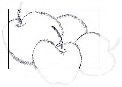
An awareness of space beyond the actual edge of a design is implied space. Implied space is frequently used as a deliberate tool for extending the viewer’s perception past the confines of the page. This can be achieved by extending a shape beyond an imaginable border (figure 3). When presented with symbolic space common in everyday life, the viewer visualizes what lies beyond it.
Texture & Pattern
Texture adds interest visually, by combining many line qualities and tonal depths, much like form.
Visual texture (artificially contrived) relies upon the use of pattern within design itself. Patterns are defined by repetition of rhythmic lines, shapes and colors and have the ability to convey the perception of movement through repetition and direction, or static decorative states through alignment.
Our sense of texture, not only relies on sight, but also on the tactile sense of touch. Of all the design elements, texture is the only one that can use our sense of touch to depict depth. The actual texture of the ground is just as important, because the visual outcome of the design is based upon it.
Some analogies, gathered from history, reveal a link to texture and psychological implications. For example: within Egyptian pyramids, texture is used to depict symbolic references to heaven and hell. The rough descending path-way represents the decent to hell, while the smooth ascending path represents an aspiration towards heaven.1
Color
Color cannot exist without light, and our perception of it.
Many factors influence the way light is perceived, including the texture of a surface and the direction of a light source. These combinations enable the artist with an infinite selection of color choice. The most powerful tool of the designer is the limitless number of these variances and are subject to much exploration in the field of design.
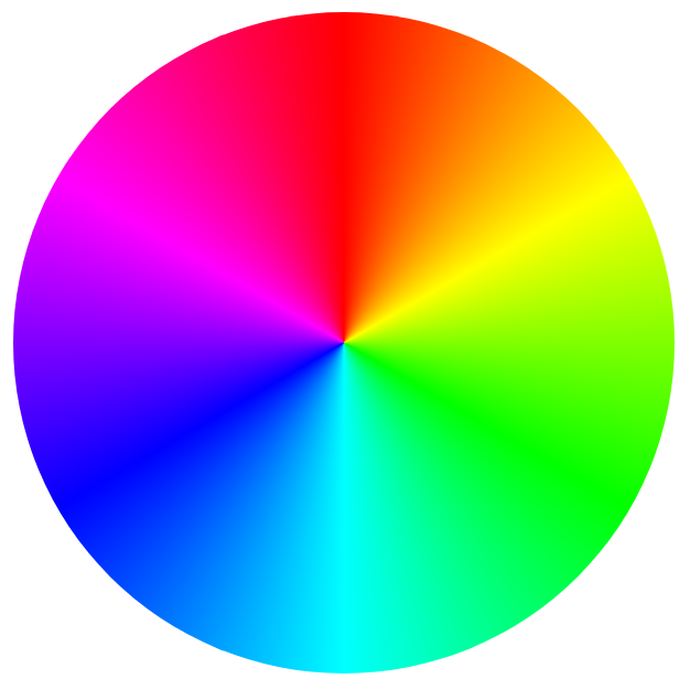
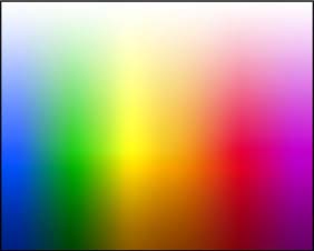
Figure 6 (bottom): Color spectrum.
The color wheel (figure 5), breaks down color into distinct families of primary colors: red, yellow and blue, from which all color is derived. Upon mixing any two of these colors, secondary colors are achieved: green, orange, and violet. One step further produces tertiary colors: yellow-orange, orange-red, red-violet, violet-blue, blue-green and green-yellow. Variations of names for these colors abound but, their pigments remain the same.
Properties of color such as hue, value and intensity contribute to the immense selection of color choice (figure 6). Colors form relationships to each other within these different variances. Hue is the color itself, defined above, and is the basis for value and intensity.
Value refers to the relative darkness or lightness of a color, and intensity (chroma) indicates the brightness or dullness of a color. Color values that are lighter than the purest state of that color are called tints, those darker are called shades.
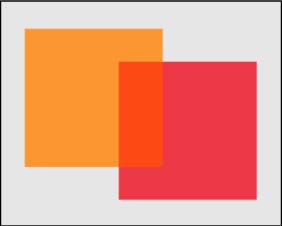
Three colors, adjacent to one another on the color wheel are analogous colors. These colors are generally used to create color harmonies. Colors in opposition to each other are complementary, and are in contrast to each other.Red and green, used in juxtaposition, will dazzle the eye. The eye cannot focus on both at the same time. This kind of conflict can lead to extreme visual excitation.
It is also important to account for the illusive quality of color through our visual senses (figure 7). The viewer’s ability to combine colors within proximity, then forming translusive interpretations of these qualities, could alter the designer’s intended vision.
Based on Joseph Albers principles of afterimages, perception of a color will alter in relation to adjacent colors. For example: when a chromatic color is placed next to a neutral gray, the gray will appear tinted with a hue of contrast to that color. Because the human mind has a tendency to acclimatize to a color scheme, this induced color perception may create an illusionary quality. In nature, one sees this illusion when light varies in tints of illumination from pink, orange, yellow and pale blue. While the color constancy remains, we still perceive the color that lies beneath.
Shape & Form
Natural, geometric, abstract & non-objective
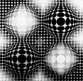
Figure 9 (bottom): “Vega X4” by Victor Vasarely.
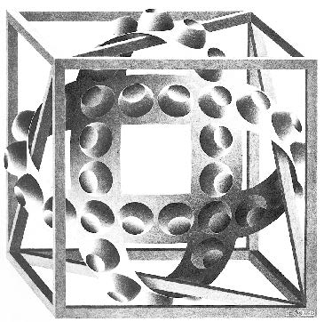
Lines, often in combination with the perception of color, moving in and out of space, create shape and form. Both of these are elements of design, but they are inseparable from each other. Shape is two-dimensional, created by a perception of visual contrast. Form is the three-dimensional quality of shape; the shape’s mass or volume.
There are four ways to categorize these elements: natural, geometric, abstract and non-objective. Natural shapes and forms are derived from the natural world, including the figure (human form). These can also be considered geometric since much of the natural environment mimics the square, circle and triangle.
When shapes and forms are minimimalized or altered to emphasize certain qualities without reference to realism, they are abstracted. Abstracted shapes and forms are used to symbolize and simplify design. In contrast, nonrepresentational elements do not reflect any recognizable image. Due to our need to define elements visually, familiar shapes are often recognized within the non-representational design.
Perception
In the transition from matter to mind, perception can be defined as sensation with meaning. Perception is shaped by our experiences, environment and cultural back-ground. Our reactions are a result of our individual perception. People see, perceive, then react to stimuli. In other words, our unique perception is subjective to variations in our background and information that our senses gather. This process is recurrent throughout an individual’s daily life and enables them to function within society.
Based on the ‘Gestalt Principle’, the human mind forms groupings of events and objects, in order to connect, classify and define stimuli. People differentiate between animate and inanimate, human and nonhuman, mental and physical things. They seethe sum of all parts as a whole and distinguish these differences and similarities between all things, so that they may react appropriately.
It is natural and instinctive for the human mind to classify information in this way. The need to structure their lives stems from the need to understand their surroundings in order to form a response. In art, this knowledge is important for communication of ideas, thoughts, opinions or feelings.
In order to present the viewer with a format that is understood, certain aspects of perception must be taken into account by the artist. This will determine the ease with which the information is passed from the artist to the viewer. The physical aspects of perception include touch, smell, taste, sound and vision, but in design the primary concern is associated with vision.
Visual balance strongly relates to psychological reaction. To a degree, tension will rise and a nervous feeling will exist in its absence. Visual weights, within the dynamics of the composition, define this balance. Whether through vertical, horizontal or radial balance, the eye must be able to sense balance in a composition in order for the mind to feel welcomed to interpret the artistic experience. Good layout of this balance calls attention to a message making it more accessible.
Artists have experimented with areas of perception to produce illusions. Illusions surprise us and play with our perceptions. They trick the mind into mistaking visual information, perpetually flipping it between two or more realities. Even though the mind knows that its senses are being fooled, the effect of an illusion does not stop once this is acknowledged.
Emotion
Emotion is the basis upon which humans form attitudes. An emotion is felt before there is a response, thus they affect all information processes and actions. They create general arousal and help to organize thought and action. Visual stimulus in art and graphic design use emotional response to reinforce a message or idea.
Specific emotions are not easily defined, but fundamental assumptions can be made to generalize them. One way to classify them is to group them into families of resemblance that have one main theme. In this way one can label basic emotion as being of interest, enjoyment, surprise, fear, sadness, anger, disgust or contempt. These emotions can be rated by their intensity and combined to form emotional traits. The complex emotions such as anxiety, depression, hostility, jealousy, pride and love all are considered emotional traits.
Emotion taints how one views the world. For instance, fear tends to create tunnel vision, causing only the object that is frightening, or a route of escape to be the focal point. While experiencing joy one tends to see the world in harmony, through a kind of optimism.
In 1965, an experiment was conducted by Izard, Nagler, Randall and Fox, in order to demonstrate how an emotional state can determine what is registered in our consciousness. Upon entering a room, the subjects were treated either hostilely or friendly, then were told to report their feelings about certain images. Those that were made angry, were more apt to feel violence from the images and those that were treated nicely, felt significantly more joy. Therefore, influencing a persons reaction by altering their mental state, can affect their interpretation.2
Emotions themselves are not considered the behavior or reaction, but only as the catalyst that drives them. Reaction to our emotions include cognitive processes (perception, imagining, remembering and planning), as well as, locomotory activity (tension in the body, electrical activity in the brain, circulatory system and respiration). When an emotion is intense, one feels a surge of energy, such as the thrill of excitement or the pangs of heartbreak. Emotions almost always have an outward aspect, a response, reaction or behavior. These responses may be as simple asa frown or as complex as uncontrollable laughter.
Universal causes of basic emotion are common across all cultures.Threat of real danger causes fear in all people, while personal accolades cause pleasure. Creating a response from the viewer relies upon the way in which the artist communicates their emotions and beliefs. Being aware of universal traits and patterns of emotions, while developing a design, can only enhance and clarify the intended message.
Excitement about the subject matter triggers a stir of emotion, it gives expression to a design. A static design with little integration of design elements does not arouse this, unless the viewer has had a prior relationship to the images.
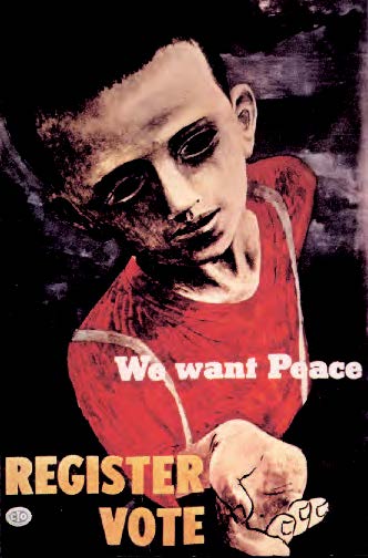
Advertisers are increasingly relying on emotion to make their products stand out beyond their competitors’. Companies realize that they can out-market each other by appealing to the emotions, the needs, and the desires of consumers. Emotion establishes a relationship between society and is the basis for creating customer loyalty.
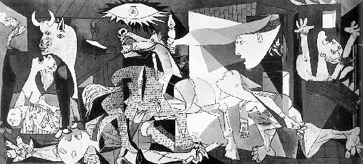
When analyzing the dynamic qualities within a design, expressive characteristics are projected upon that design. The brain may see generalities, but is not limited to visual input. These expressive characteristics describe the reaction to the environment, the nature of the mind and emotions that are felt with them. This projective state and urge to characterize with human qualities is termed anthropomorphism. The aggressiveness of a zigzag, the sharp transient motions of lightning or the broken edge of glass is an example of projecting this expression.
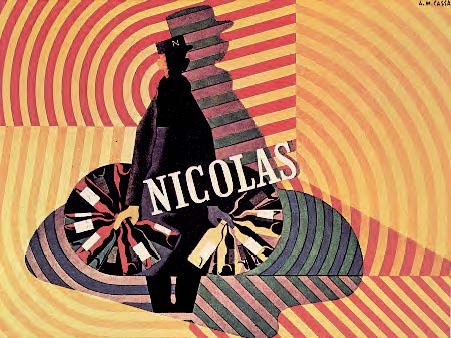
Elements of design tend to symbolize temperament in this same way and can be used to characterize the personality of a design. Certain colors, patterns and combinations of these, may remind one of a place in time and the emotions felt at that moment. This might be a unique experience to one individual or a common experience shared by a collective knowledge. The psychedelics of the sixties, soft pastel colors of the tropics, colors of a season, and design elements associated with fashion trends, are such collective experiences. Fashion and design are closely linked to one another and reflect a mood of specific time. With this in mind a designer must be careful to integrate all aspects of design appropriately to reflect the desired feeling or mood of the design.
Colors and color combinations, as with all design elements, can evoke strong emotional responses in people. They cause visual excitation or relaxation depending on their use. Large corporations do extensive research on the effects of color combinations in conjunction with advertising to insure the desired response from consumers.
Psychological analyses categorize colors by having warm, cool and neutral traits. The human eye sees warm (red and orange) colors as visually exciting, tending to be more dominate against the cooler (blue and green) colors. That is why warm colors are often used in hospital rooms to help depressed people feel less depressed and cool colors are used as a calming agent for overstimulated, stressed people.
We also characterize emotions felt with images that resemble the human body. A column that bows and is slightly larger at the bottom can physically resemble the stress that is felt when we are carrying a heavy load. Through this process one might mentally feel the stress of that column by projecting their own feelings upon it. Theodor Lipps suggests in his ‘Theory of Empathy’ that perception of expression involves the activity of forces. This denotes why expression can be found in inanimate objects. People remember feelings involved that are similar to them, from past experiences.
In continuity of this theory, Rudolf Armheim questions the feelings expressed, being that of the artist or those of the viewer. He goes on to say that the comparison of the object’s expression with the human state of mind is secondary to the viewer’s projection of empathy. In this interpretation, an object is not just happy because it looks like a happy person, but possibly because the design elements convey that emotion and reflect the viewers empathy. By using this theory, it becomes easier to metaphorically use words pertaining to emotions to describe an image.3
Communication
Social environments and cultures are built from communication. The awareness of how this happens, varies between people and groups within a community. The system of messages and representations sometimes frame an individual’s sense of this community and at other times only reflect the individual’s connection to it.
Communication provides information, an explanation, or point of view. If effective, a design urges a reaction to behave or think in a certain way. The artistic experience adds to the reactive state of the viewer and separates itself from the detached acceptance of pure information. What an artist wishes to communicate determines the way in which the design is composed and what is emphasized. Meaning in design is not strictly created by the artist. The viewer must allow themselves to fully analyze what they see in order to facilitate the message.
Communication also provides contact with other people, or images of interactions between them. This leads to social concern, appealing for help, calling attention to and making the public aware of an issue that they would otherwise be ignorant of. Communication is important to the inspiration and growth of society, expanding its knowledge, and developing expression of individual personality in the messages and representations that are emphasized. Individuals affirm their identity within society this way.
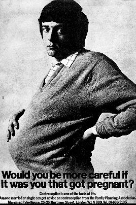
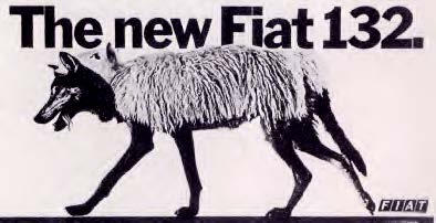
Figure 18 (bottom): Advertisement for Fiat by Neil Godfrey; illustration by Alan Brooking.
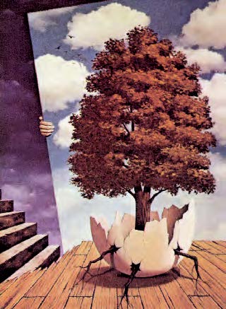
Imagery is the crude material in visual communication. It is composed from the memory, imagination, dreams, fantasy and reality specific to the creator. No two artists will create the same exact reflection of a subject matter, since an individual’s perception of these is varied. Choice of imagery in design affects the public consciousness in a variety of ways, insomuch as any two images that are combined are often analyzed by the viewer in relationship to one another.
Photographs are frequently interpreted as a visual link to the tangible world. They have a strong affect on the viewer, giving an awareness of their world and their identity within it. “Photographs show proof, evidence and a record” (Edward Clibborn and DanieleBaroni)4. A photograph forces some reaction from the viewer, by emphasizing the subject with an image in time. Warping or twisting this reality through the use of computers or other media can trick the viewer into a belief that is universally known as false. The closer the image is to photographic quality, the more believable it becomes.
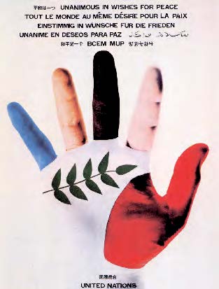
Symbols are simplified images meant to communicate the essence of ideas and objects. They have form, definition or significance. Symbolizing universal content can be achieved, not only through use of design elements, but by the subject matter as well. Although commonality between symbols implies a universal idea, a form may represent a different meaning placed within a different context. This combination can be used to imply qualities about the images that they are placed in relation to.
One of the most potent forms of a symbol is typography. Words provide instant flashes of insight within a specific order. This form of imagery still relies on unification of elements within a theme, to communicate an idea besides the actual words themselves. All elements of design should be taken into consideration in type selection, because application of typography can either appropriately reflect and clarify an idea, or contrast and confuse the viewer.
Within the human facial expression and gesture, people tend to interpret from their own past experiences, stereotypes and symbols. Information about a figure is not only interpreted by its face and gesture, but also from insinuated symbols that reflect the same state. Physiognomics is a method of direct cognition or reflection of a figure’s mental state. The only problem existing within this formula is that symbolism and stereotypes vary from person to person and cannot be precisely measured.
In the creation of a company’s identity, advertisers make full use of these implications. Logos and trademarks are used to impress upon society a desired image of the company they reflect. Identity does not stop with the creation of a logo. Packaging, and graphic design within advertising, combine all aspects of design to portray a unified vision to the public.
In conclusion, effective communication is dictated by the emotions and perceptions connected to the viewer. Special consideration and research of the viewer’s response towards elements within a design should be taken into account by a designer, if they are to project the message clearly and precisely.
1. http://www.guidancecom.com/alphabet/texture.html
2. Caroll E. Izard, page 23.
3. Rudolph Anheim, pages 448-449.
4. Edward Booth-Clibborn and Daniele Baroni, page 76.
Bibliography
The Alphabet of Art, http://.guidancecom.com/alphabet
Arnheim Rudolf, Art And Visual Perception, A Psychology of the Creative Eye, University Of California Press, Berkeley, Los Angelos, London, 1974. pp.445-461.
Baroni Daniele and Booth-Clibborn Edward, The Language Of Graphics, Harry N. Abrams Incorporated, New York, 1980. pp. 9-22, 33-76.
Bevlin Marjorie Elliot, Design Through Discovery, An Introduction to Art and Design, Harcourt Brace College Publishers, Fort Worth, Philadelphia, San Diego, New York, Orlando, Austin, San Antonio, Toronto, Montreal, London, Sydney, Tokyo, 1991. pp. 6, 47-49, 63-86.
Biren Faber, Color Perception In Art, Van Nostrand Reinhold Company, New York, Cincinnati, Toronto, London, Melbourne, 1976. pp. 21-26, 64.
Collier Graham, Form Space And Vision, discovering design through drawing, Prentice Hall, Incorporated, New Jersey, 1963. pp. 12, 24, 73, 78, 146.
Color Emotions, http://.www.imswebtips/issue55top1.html
Dewy John, Art As Experience, Minton, Balch & Company, New York, 1934. pp. 58-105.
Introduction to Perception, http://.www.illusionworks.com/html/introduction_to_perception.html
Izard Caroll E., The Psychology of Emotions, Plenum Press, New York and London, 1991. pp. 21-25, 33, 56.
Nostrand Van, Design And Form, The Basic Course at the Bauhaus and Later, Reinhold Company, New York, Cincinnati, Toronto, 1975. pp. 62-63.
Sasaki Hiroshi, Color Psychology, http://www.Shibaya.com